Read Dead Online - Animated Promo Mockup
While browsing through Rockstar Games’s homepage, I was drawn to one of the promotional graphics for Red Dead Online’s upcoming Holiday event. I wanted to challenge myself by recreating parts of the graphic to be fully animated under a tight turnaround time. I’ve included a brief breakdown of my process using both Photoshop and After Effects:

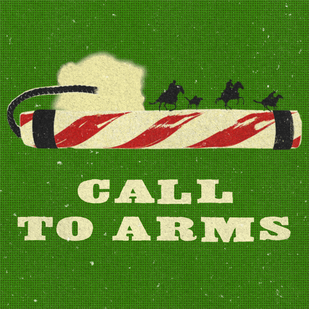
The Initial Animated Mockup was drawn in Photoshop and was comprised of several frames. The added delay between frames aimed to replicate a slight stop-motion look.
The goal was to demonstrate what the motion graphics would look like prior to recreating it in After Effects. One idea during this stage was to consider playing a bit more with the white noise and texture of the graphic, as to lean more into the Winter Holiday thematic, though to also dial back the size.
The goal was to demonstrate what the motion graphics would look like prior to recreating it in After Effects. One idea during this stage was to consider playing a bit more with the white noise and texture of the graphic, as to lean more into the Winter Holiday thematic, though to also dial back the size.

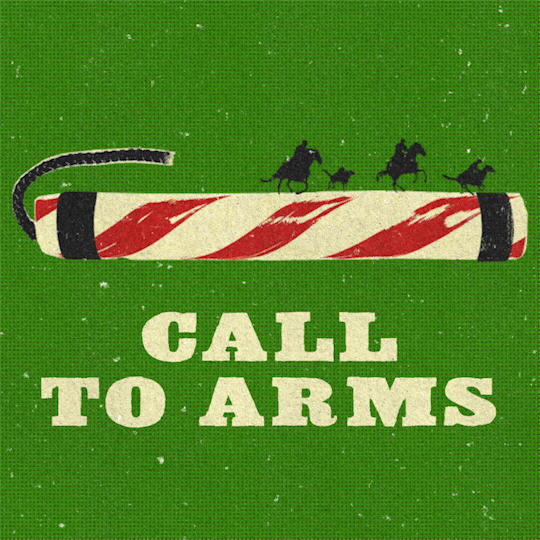
After putting together the initial mockup, I began to cut out the stick of dynamite, its fuse, and the riders on their horses to bring into After Effects. The text was loosely recreated with another bold serif font (Akenaten), and the halftone background was made in the program using a combination of solid layers and effects.
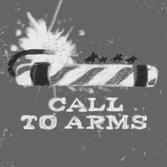
Provided on the left is a very Early Iteration of key elements prior to any animating and polishing.
Provided on the left is a very Early Iteration of key elements prior to any animating and polishing.
Shaky effects were applied to the text in order to give it a more active look, acting as a literal “call for attention.” There was an initial attempt to apply the same effect to the dynamite, fuse and riders, though it made the piece feel too noisy with everything moving all at once. Instead, it felt better to keep those elements static as to act like an anchor for the rest of the moving elements to contrast against.
For the texturing, paper scans were added in to give the light and dark elements a visibile grainy texture. Although they were not included in the original promotional material, as it instead used subtle halftones for the lighter colors, I felt it was a good opportunity to give the piece a more rough and gritty feel to capture that special Wild West thematic.
The noise was added separately, with the aim of emulating both the texture of scuffed paper and the illusion of snow falling from above.
Additional effects were added to the text to allow for individual letters to move and scale at random, with posterized time further pushing for that stop-motion look.
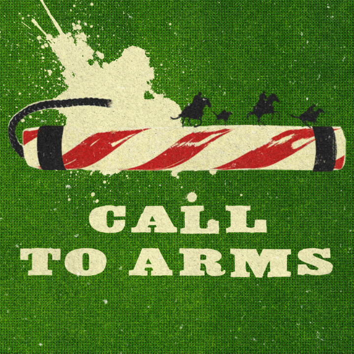
The burning fuse in this Later Iteration has blurred edges that try to replicate the look of liquid having soaked through the material, with the goal of adding additional splatter droplets in an overlapping layer to build upon its shape. However, the blur effect ends up making the splatter somehwat resemble runny water color paint, which was not the intended effect.
The burning fuse in this Later Iteration has blurred edges that try to replicate the look of liquid having soaked through the material, with the goal of adding additional splatter droplets in an overlapping layer to build upon its shape. However, the blur effect ends up making the splatter somehwat resemble runny water color paint, which was not the intended effect.
After discarding the blur effect from the animated splatter droplet, a handful of additional splatter textures were brought into the composition. Each texture was mixed-and-matched together to help build unique shapes, and then adjusted to appear whenever the animated splatter droplet changed forms during the looping sequence.
The background in the Final Iteration was given an additional halftone screen layer to add a more rugged look while also boosting the contrast for the lighter elements.
The background in the Final Iteration was given an additional halftone screen layer to add a more rugged look while also boosting the contrast for the lighter elements.